After seeing the images of the tragic Turkey earthquake, I decided to see if the same technique that I am using to predict sunspots could be used to predict earthquake risk. Preliminary results show a very high correlation. The new image below shows when large earthquakes have occurred.
I do not think that a perfect earthquake warning system can be developed in the near future. However, I believe there is more that can be done than is now. For example, in the central part of the United States, there are Tornado Watches when the risk for a tornado developing is high. I believe we need Earthquake Watches when the risk for an earthquake is high. When a weather report is given, I believe, the meteorologist should mention what the earthquake risk for the day is.
Some Earthquake Risk Factors:
I believe, not enough is being done about the 2nd and 3rd risk factors. For example, the following graph indicates how earth's acceleration is changing. (The green curve shows how a major earthquake hit Taiwan when the earth's velocity had a major change. To see the entire green portion of the chart, see below.)
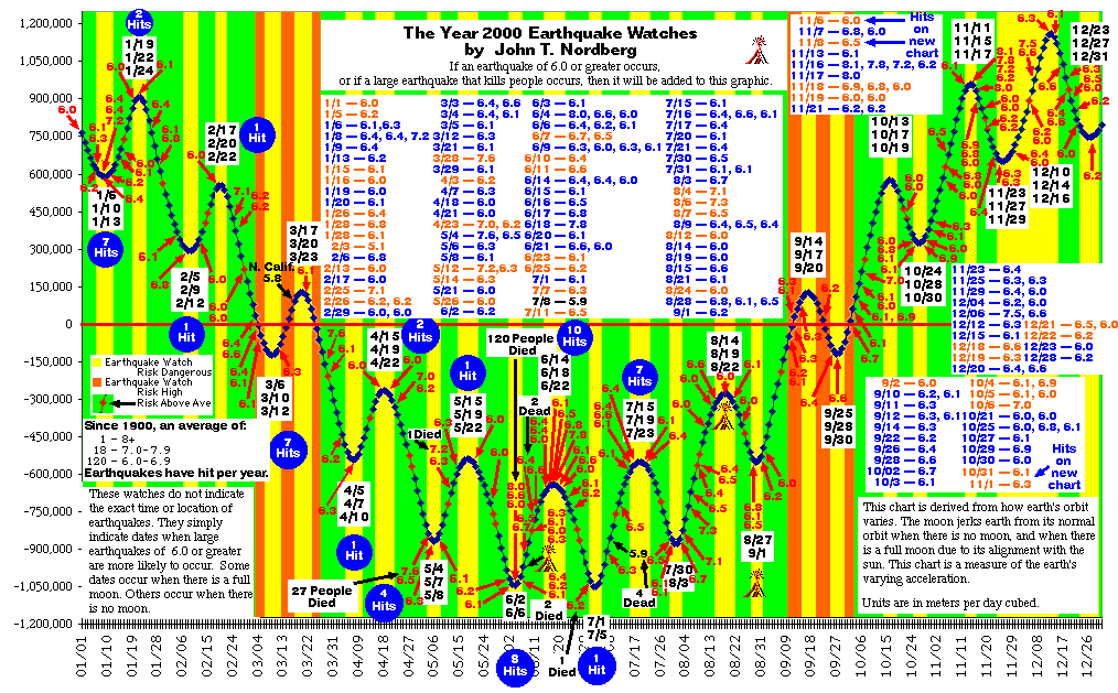
My latest Earthquake Watch chart for all of the year 2000 is below. The first date in the box is the beginning of the watch, the second date in the box is the approximate midpoint of the Watch, and the third date is the endpoint of the watch. The day after a watch will still have high or at least above average risk for a major earthquake.
This is the chart for the end of 1999. I did not even think of doing this until 8/17/1999 when the massive earthquake hit Turkey. My chart above, for 2000, differs from the chart below. In 2000, I will stress the points where the line cross zero and the midpoint between turning points.
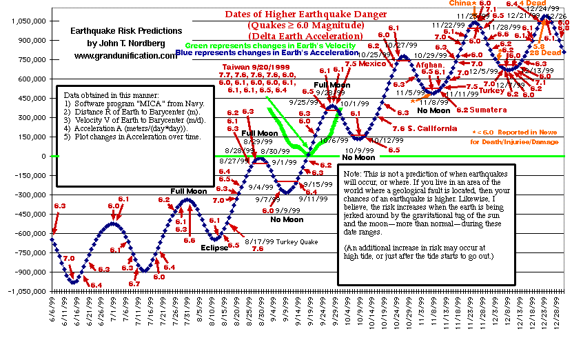
The Turkey Quake did not happen exactly when I would have predicted. However, the danger was higher than average. Were the people of Turkey aware of this? Of course not. Many deadly earthquakes in the past have occurred close to early turning points in this chart.
They say statistics don't lie, but liars use statistics. How, you look at data can make a big difference. Deadly quakes have a high correlation to this technique. The correlation drops to about 78% (apparently this is very good -- about 3 times the chance rate) when quakes of 6.2 or greater in magnitude are used. But what should the cutoff be? 6.2? 6.0? I have not been able to study this enough to say what the correlation really is, but if you look into it, it makes sense, and seems obvious. (I have decided to modify my cutoff to 6.0 after further review.)
To find out about the latest earthquakes, go to: http://www.geo.ed.ac.uk/quakexe/quakes
or, http://wwwneic.cr.usgs.gov/neis/bulletin/
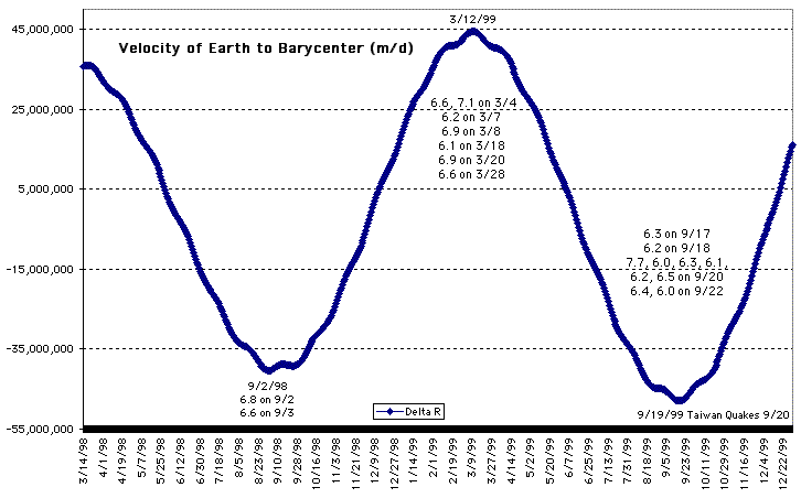
A more accurate picture of the earth's motion would include a plot of changes in velocity as well as changes in acceleration.
When the earth's velocity changes direction, then earthquakes are more likely to occur. The latest major earthquakes that occurred in Taiwan happened at just such a turning point.
Please, spread the word about this technique for predicting earthquakes.
It could save lives.
To see the special page on how earthquakes can release balls of light, click here.